The Design of Opportunity
Winners Plus Inc. is an organization that helps guide families and their children to strive for a better future through education.
They needed visibility and a logo that could convey their trustworthiness, sense of community, guidance, and Winners Plus Inc.’s commitment to helping.
This project consisted of 3 deliverables for my client
-
The design of the logo is inspired on the Northern Star (guidance), and figures of people surrounding it to communicate unity and community.
And to keep elements from the previous logo, the originals colors of red and blue were used for the redesign.
-
For this design, I focused on a "less is more" approach to create a clean and professional look. The business card is one-sided.
I incorporated the Winners Plus Inc. logo as a subtle pattern, reinforcing brand identity without overwhelming the design. The result is a modern and impactful card that effectively represents the organization.
-
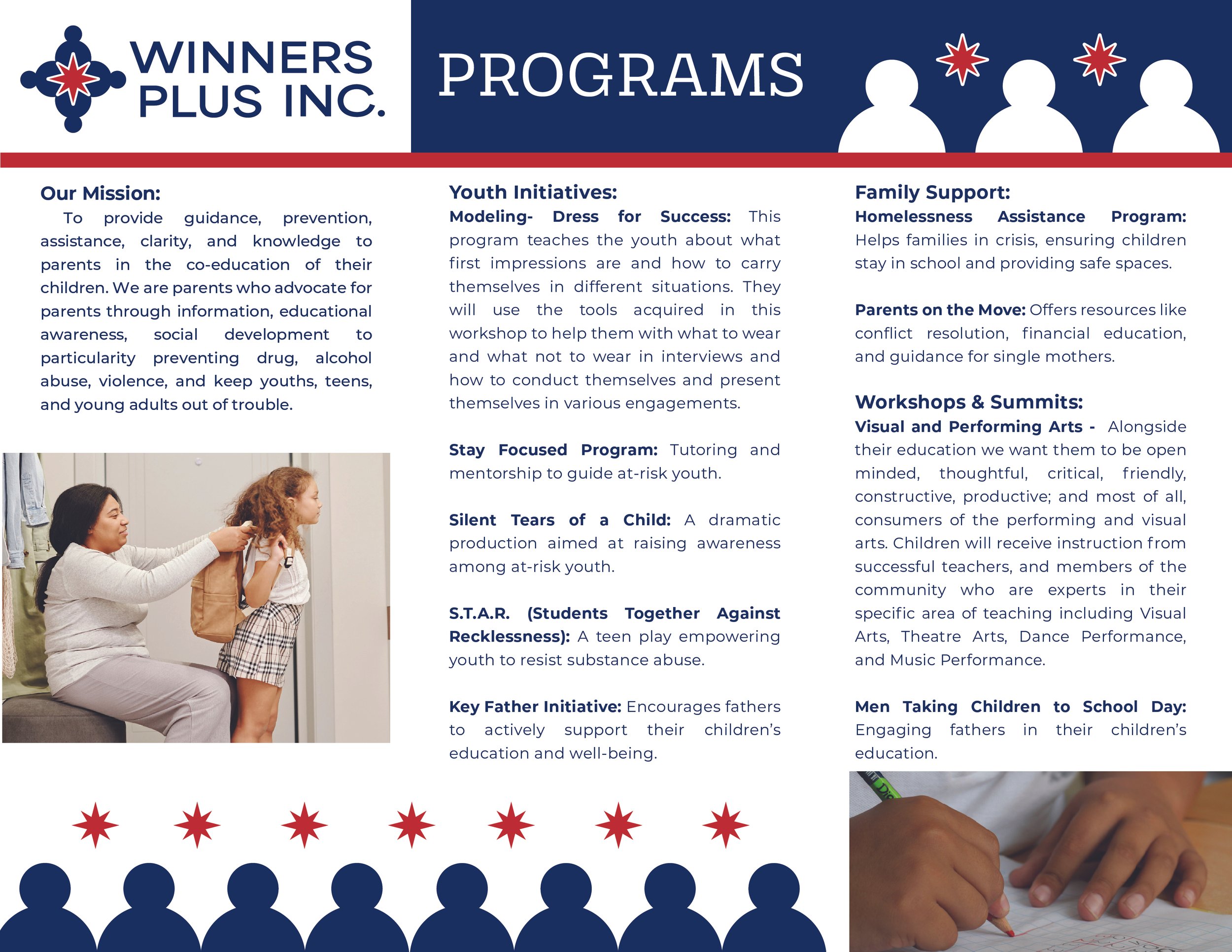
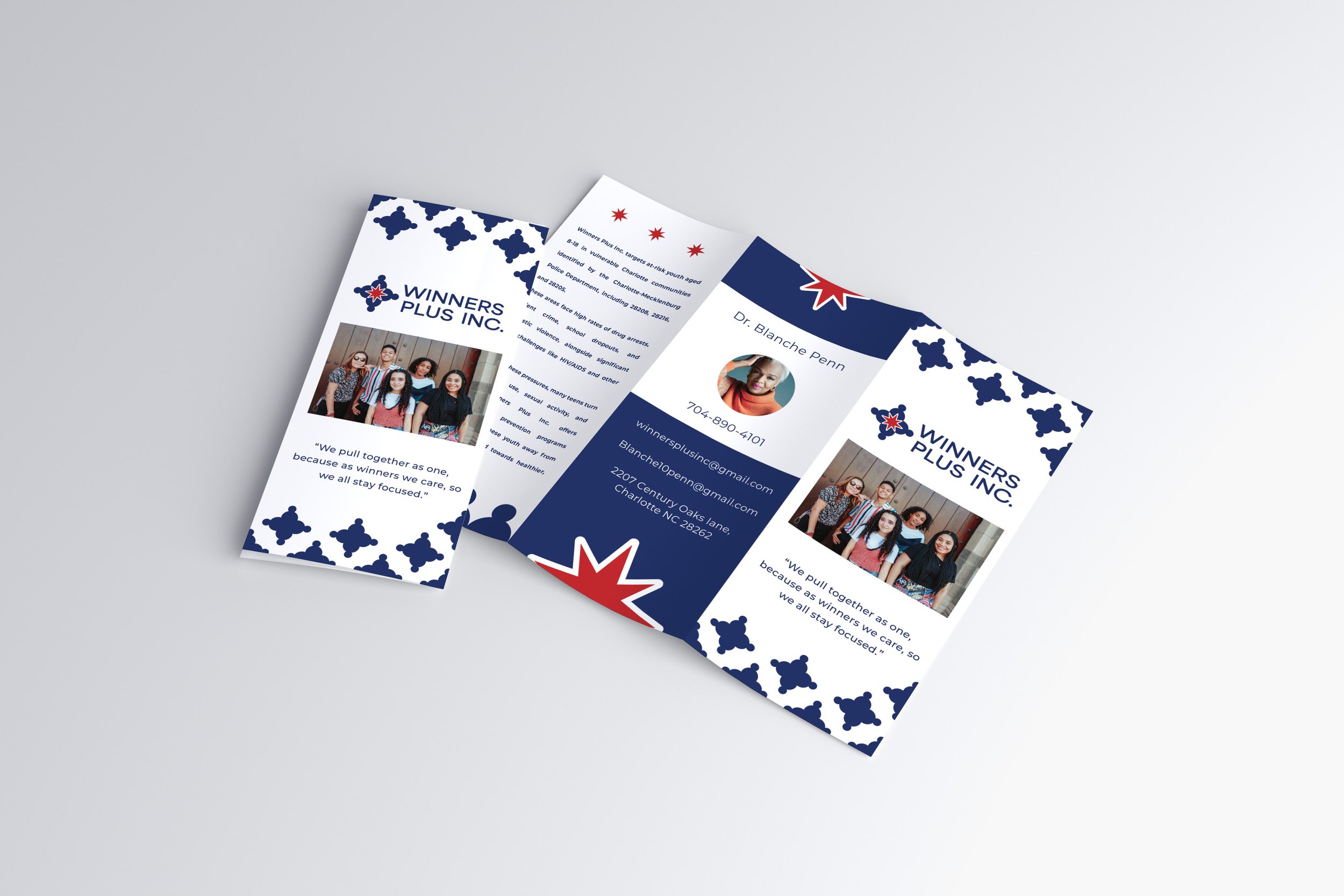
For this design, I focused on reinforcing the brand’s visual identity by incorporating various logo elements throughout the layout.
Strong contrast and hierarchy guide the reader’s eye, ensuring easy readability and clear communication of key information.
The use of imagery featuring the target audience helps create a more personal and relatable connection.


